Repositioning a Purpose-Driven, Black Women–Led Consultancy
Repositioning and full rebuild for a Black women–led, research-first consultancy — site, custom-coded parallax hero, and a documented brand system.
- Client
- The Sax Agency
- Role
- Brand & Web Design · Front-End
- Year
- 2026
- Scope
- Positioning · Brand System · Web Design · Custom Parallax
Overview
The Sax Agency is a Black women–led multicultural marketing and strategic communications consultancy that public institutions, foundations, universities, and culture brands trust to reach communities of color at scale. The firm had outgrown a site that read like a content shop and buried its sharpest differentiator. The brief: reposition Sax from a service vendor to a consultancy, and rebuild the site — and the system behind it — to match the institutional trust the agency had already earned.
Positioning
Before any design, I ran an audit-style questionnaire with the Sax team across five areas — strategic foundation, positioning, messaging, and visual identity — then paired it with market research. Both pointed to the same gap: large multicultural shops compete for corporate budgets, but almost none are trusted to lead big public campaigns. Sax already lived in that lane — it had been prime agency of record on a ~$16M, 58-county statewide voter-education campaign — yet it led with “purpose-driven” and “culturally fluent,” phrases nearly every agency now claims.
So I established one idea to lead with, ranked above all the others:
We move communities of color at scale, and we prove it.
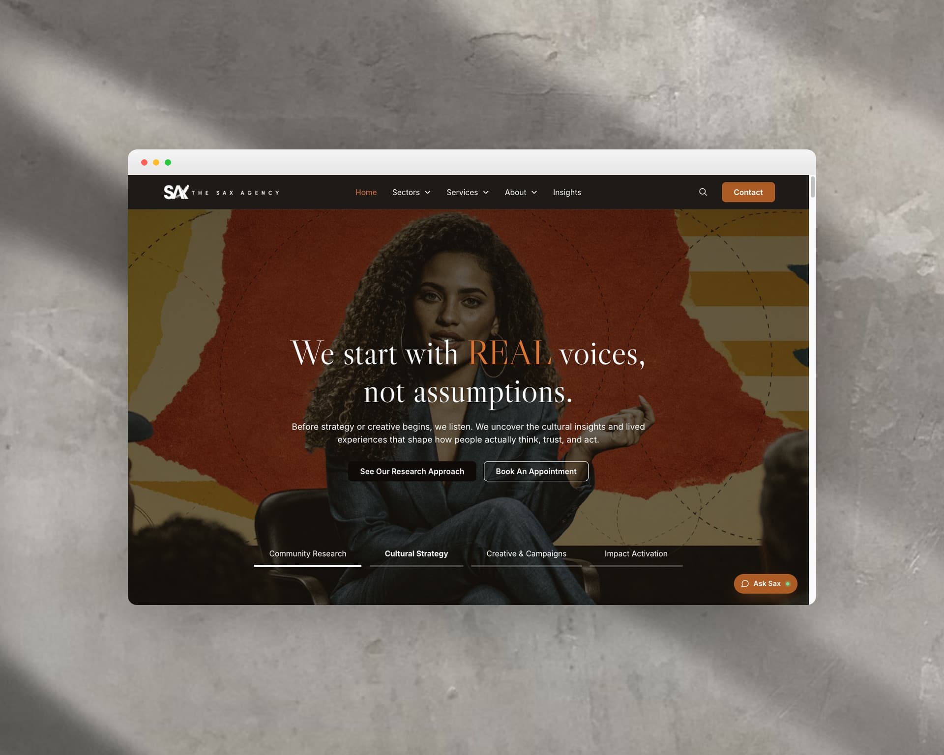
The Site
From there, every page makes that positioning concrete instead of leaving it in a deck. The home page opens on a Proof of Impact band — $16M, 58/58 counties, 10+ languages, a five-agency coalition; services are framed as consultancy-grade strategy plus culturally fluent creative; four sectors name the audiences rather than a label; and WBE/MBE/SBE certifications carry procurement credibility without leading with it. I shifted the copy from “we” statements to client outcomes, and formalized the methodology — Listen, Diagnose, Design, Activate, Measure — as the agency’s strategic architecture.
Custom Parallax Hero
The full-screen hero needed layered depth and smooth, inertial motion without breaking the click targets on its CTAs. I built a lightweight JavaScript engine that tracks the cursor within the hero, normalizes its position to a −1 to 1 range, and uses interpolation to ease each layer by its own depth, z-offset, and rotation values. The result is cinematic parallax with directional shadows and subtle background-headline motion, hero-only activation, fully clickable UI, and a single render loop that stays performant and extensible.
Design System
The strategy ships with a system to sustain it. I built the Sax brand system (v1.0) as a living, click-to-copy toolkit — not a static PDF: strategic foundation and positioning statement, four messaging pillars, voice and verbal identity, logo usage, a tokenized color palette, type scale, layout, components, imagery and motion, accessibility, and governance. Every color, token, and type style is documented and copyable, so the team can build on-brand without me in the room.
Outcome
The result functions less as a refreshed website than a repositioned digital headquarters: it leads with proof, signals procurement readiness, filters misaligned prospects, and aligns the brand voice with the agency’s leadership and the institutional trust it has already earned — backed by a documented system the team can run on their own.